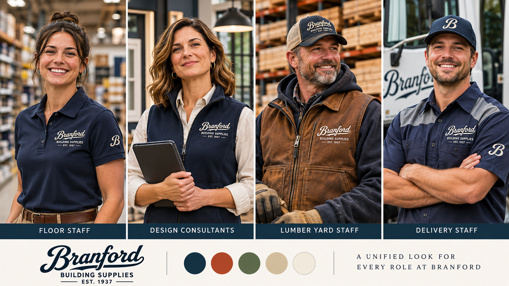


Honoring our history. Building what comes next.
Since 1937, Branford has built its reputation on dependable materials, experienced people, and lasting customer relationships.
As we approach our 90th anniversary, we have an opportunity to honor that foundation while building an identity that reflects where the company is going.
The goal isn't to change who Branford is. It's to communicate more clearly what Branford has become.
Branford is recognized for its reliability, established reputation, and expertise in windows and doors.
But the company's capabilities extend far beyond those categories.
Our opportunity: Shift perceptions from a familiar local supplier to a comprehensive regional building-materials partner—without losing the relationships and character that make Branford distinctive.
The materials behind the build. The people behind the project.
Branford's strength comes from two things working together:
Comprehensive Materials: A broad range of products and services supporting the entire building process.
Experienced People: Knowledgeable professionals who help customers navigate material selections, project requirements, and the work ahead.
Together, these strengths define a building-supply partner that understands more than the order.
A successful tagline should reinforce what Branford stands for: its history, the breadth of its offering, its expertise, or the value it brings to the people doing the work.
We're exploring several ways to express that promise. For us, a tagline isn't what comes after the branding—it's what shapes the brand.
These are proposed expressions, not final selections. The strongest tagline should complement the chosen identity and remain useful across more than one application.
Builders, Contractors & Remodelers Our core audience. They value knowledgeable support, dependable service, and efficiency.
Architects & Designers A priority growth audience. They need product expertise, specification resources, and collaborative partnerships.
Homeowners An important part of the Branford community, looking for guidance and confidence in their decisions.
One brand should feel credible, approachable, and useful to all three audiences.
Three Expressions of its Future.
Our identity exploration starts with the qualities Branford has earned—and considers three different ways of bringing them forward.
HERITAGE Preserving the recognition and character of an established name.
MODERN Creating a bold, unmistakably contemporary regional identity.
HYBRID Combining historic personality with the strength and clarity of modern trade typography.
Each direction responds to the same strategic goal through a different visual approach.
Branford's history is not simply something to commemorate. It's a source of recognition, credibility, and character.
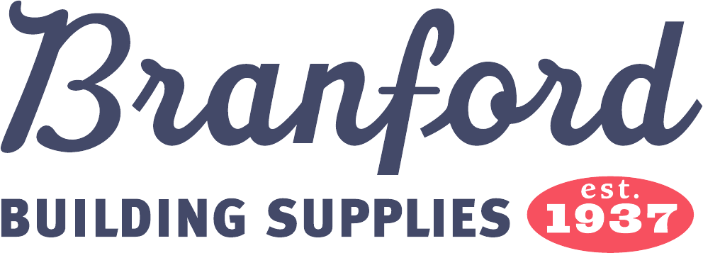
This direction builds on the familiar flowing script, refining its presentation and surrounding it with a more intentional visual system.
The vision: A timeless identity that honors the business Branford has built while feeling relevant to the people building its future.
Established. Familiar. Enduring.

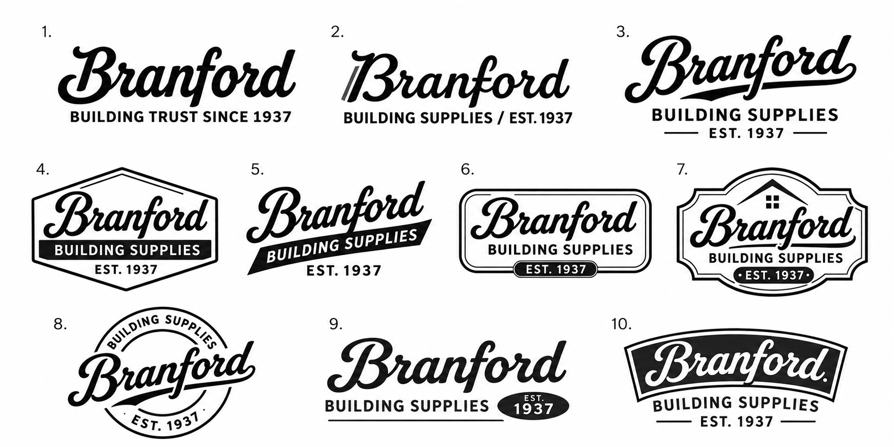
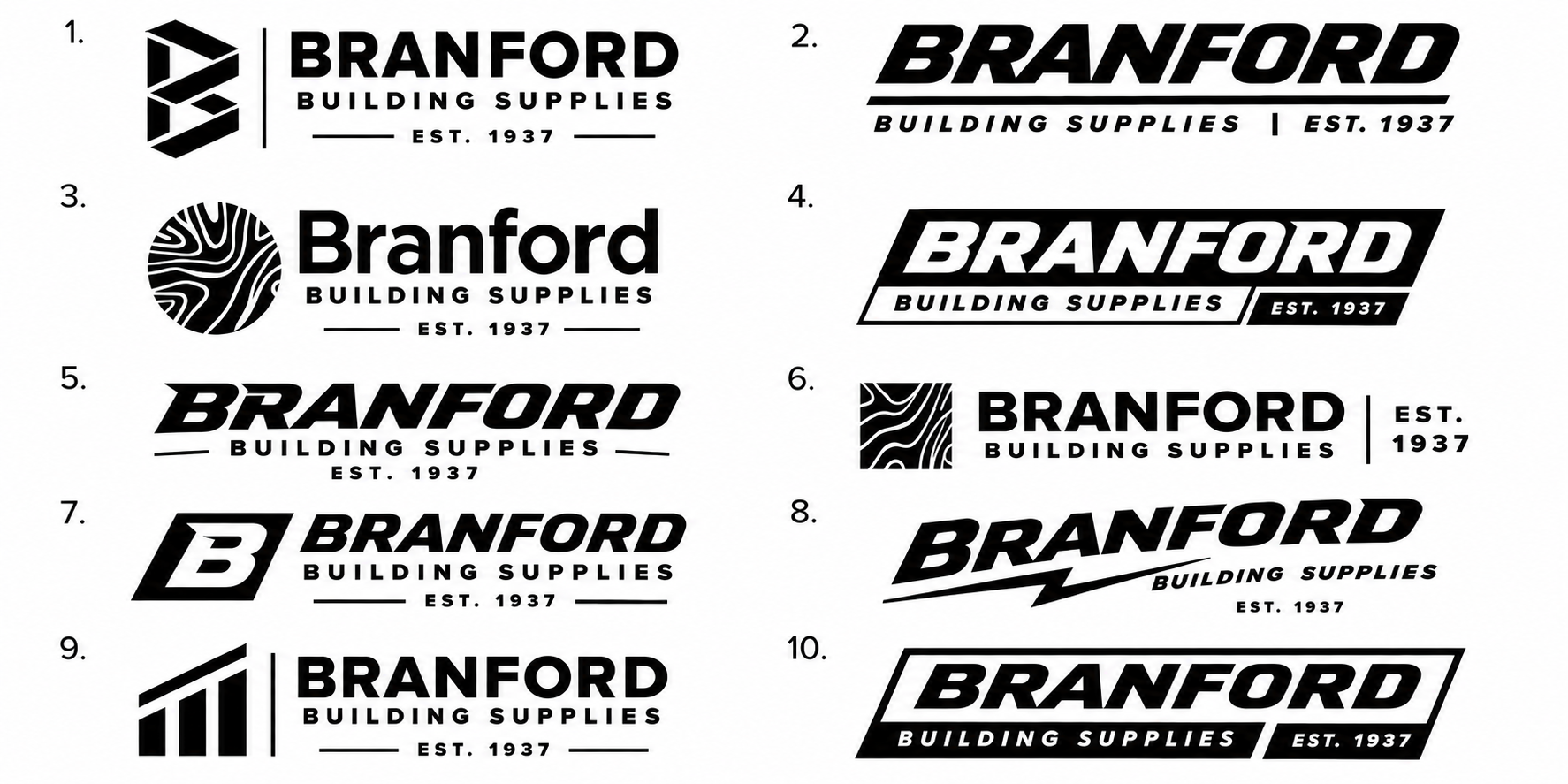
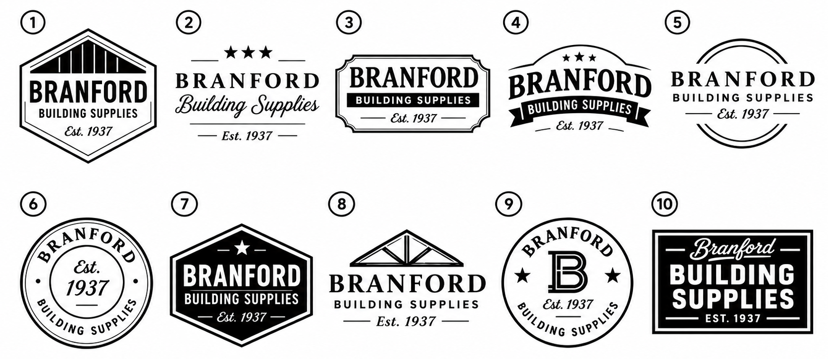
The digital equivalent of sketching—strictly focused on shape, negative space, and silhouette before adding any color. A brain dump before narrowing down concept direction.

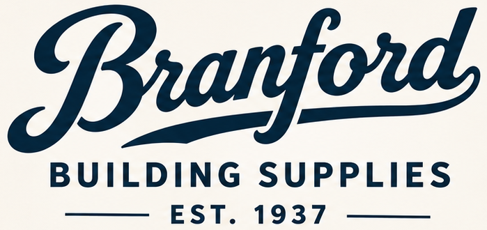
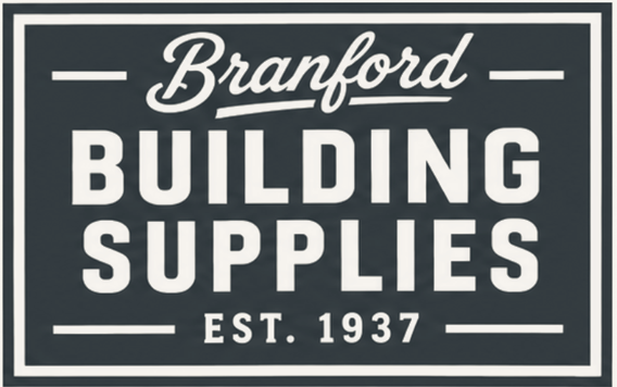
The distinctive Branford lettering remains the visual centerpiece.
An expressive underline reinforces the signature's character, while the clear BUILDING SUPPLIES descriptor and founding year connect the name to the business.
The result is familiar, confident, and unmistakably Branford.

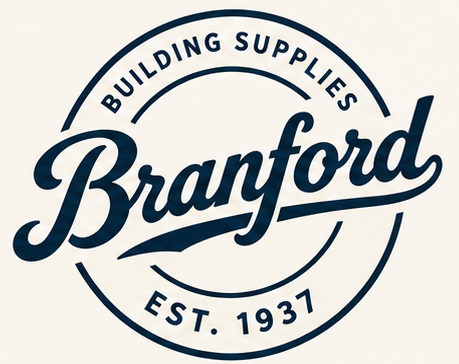
The alternate circular signature used on certain applications, works synergistically with the original as part of the brand system.
Inspired by traditional trade stamps and enduring commercial marks, it offers a more compact expression of the same identity.
The distinctive capital B carries the personality of the original script into a simpler form.
It creates a recognizable shorthand for applications where the full name may not be practical—from apparel and merchandise to smaller branded touchpoints.
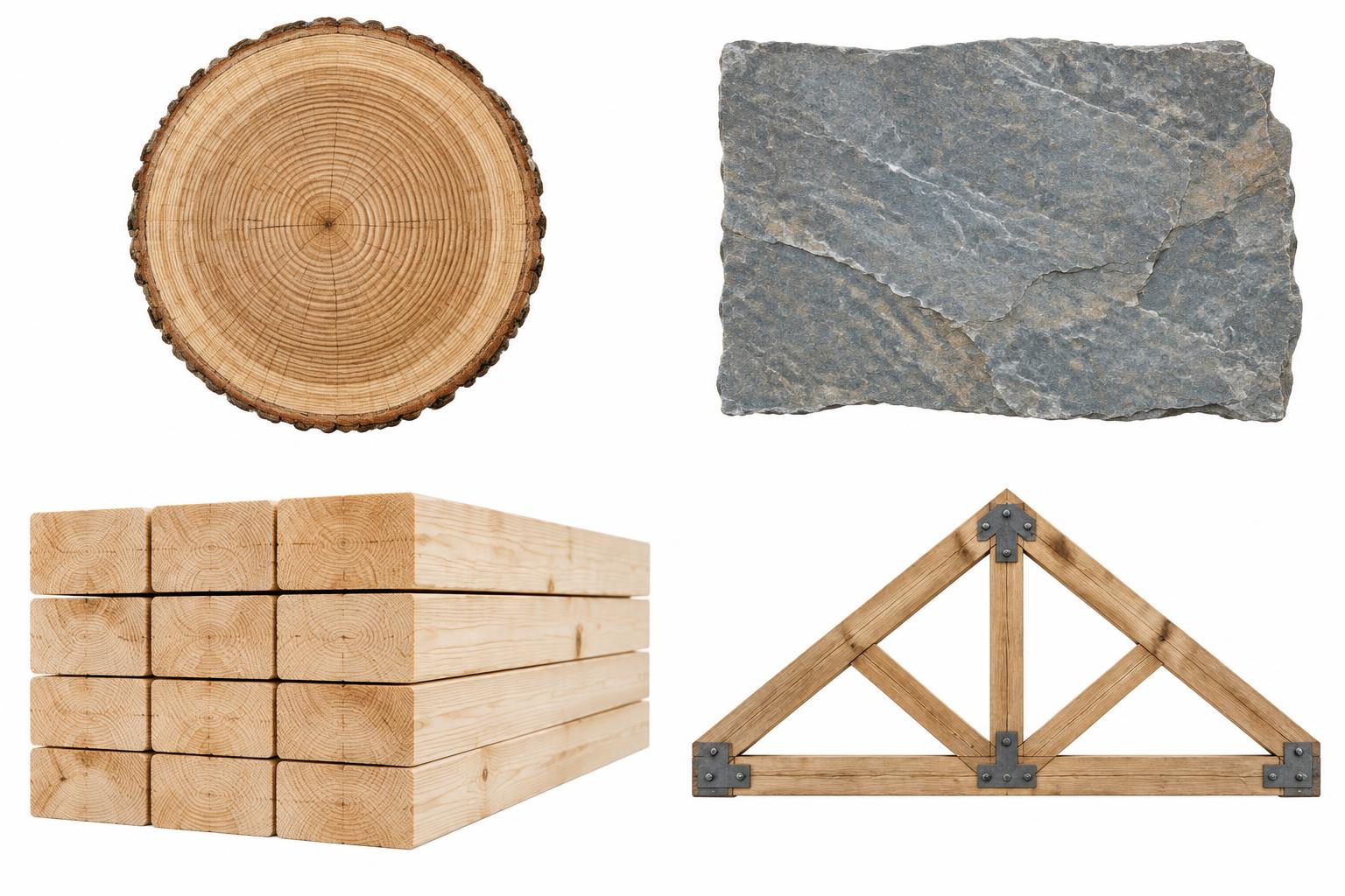
The Heritage palette takes inspiration from lasting materials, craftsmanship, and the natural environment.
#0F2D4A
Trust and permanence
#B24634
Warmth and character
#556B4F
Natural materials
#D9C8B2
Architectural warmth
#F6F3EC
Clarity and balance
Together, these colors create a grounded, confident identity with a distinct sense of history.


An effective identity must retain its character across light, dark, and limited-color applications.
The Heritage signature is designed to remain recognizable whether presented in Deep Ink, reversed in white, or paired with a restrained accent.
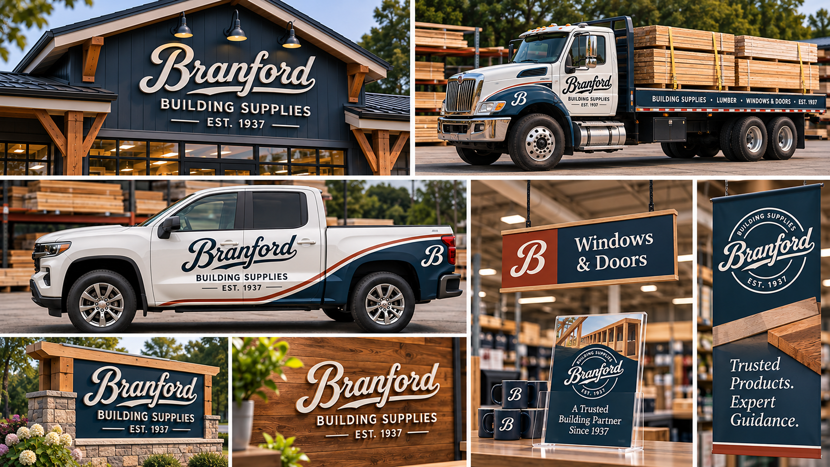
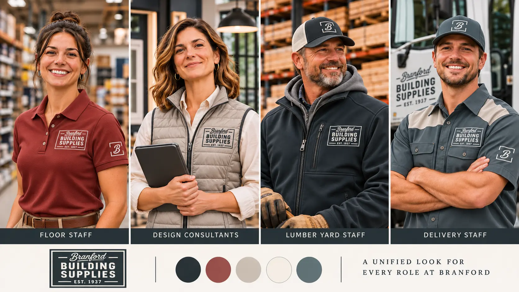
Applied to signage, vehicles, uniforms, and communications, the Heritage direction brings continuity and craftsmanship to every customer interaction.
It reinforces something Branford has spent generations earning: Recognition and trust.


This direction takes a more decisive step forward.
Confident contemporary lettering, energetic proportions, and a high-impact color system reflect Branford's broad capabilities and ambitions beyond its hometown.
The vision: A recognizable regional building-supply brand with the strength, clarity, and presence to stand confidently alongside larger competitors.
Bold. Capable. Forward-looking.

The digital equivalent of sketching—strictly focused on shape, negative space, and silhouette before adding any color. A brain dump before narrowing down concept direction.

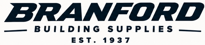
The new BRANFORD wordmark uses substantial, forward-leaning lettering to communicate momentum and confidence.
Its contemporary form offers strong visual presence, while BUILDING SUPPLIES immediately identifies the business.
The established date provides a deliberate connection to the company's history without making heritage the dominant design feature.
The custom B carries the forward movement and weight of the main wordmark into a simplified symbol.
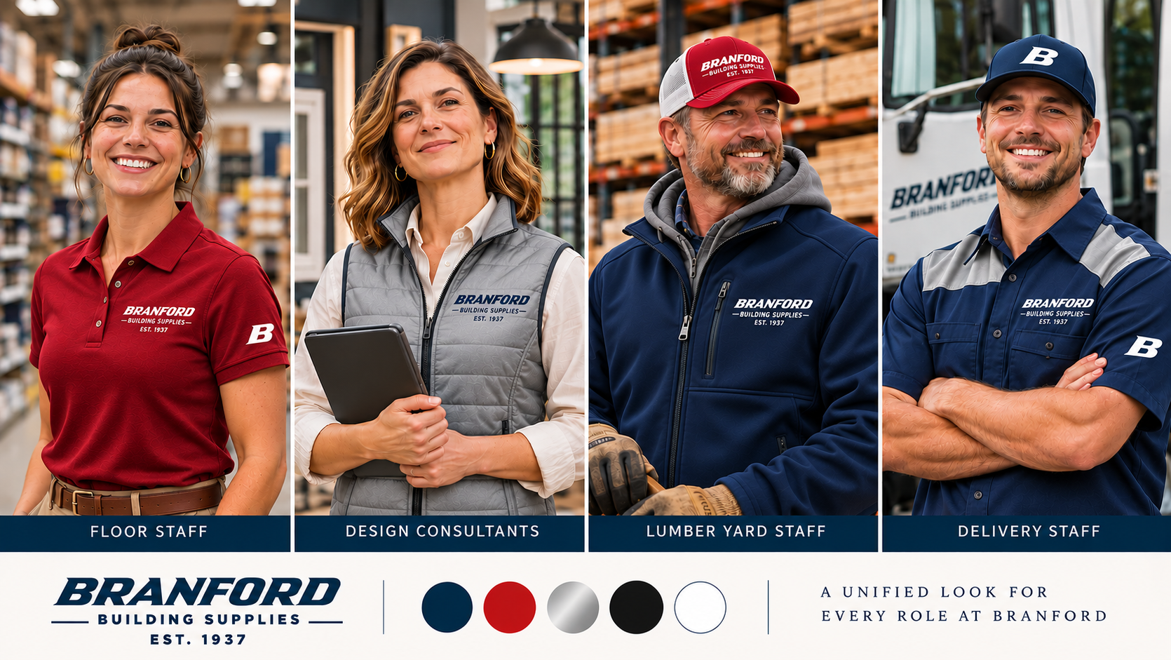
It is designed for immediate recognition in smaller applications, particularly workwear, digital profiles, equipment, and promotional materials.
A bold blue and red palette preserves a connection to Branford's established color heritage while delivering a more assertive contemporary presence.
#0B3D79
Primary authority
#C62828
Energy and recognition
#B0B7BF
Modern material character
#000000
Strength and utility
#FFFFFF
Clarity and contrast
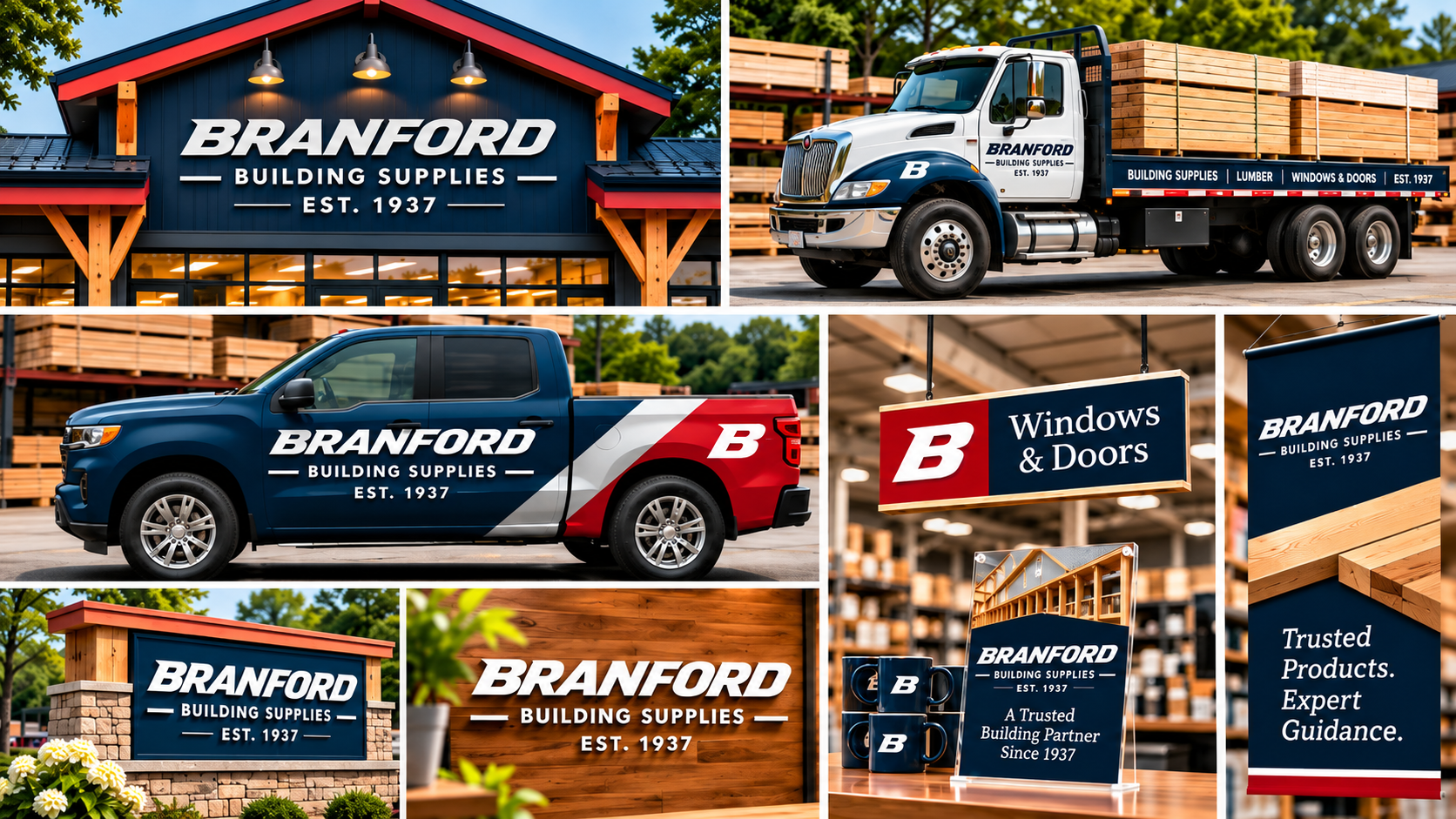
The system is designed for high visibility across physical and digital applications.


Strong contrast is a defining feature of the Modern direction.
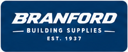
White lettering on blue or red creates a clear, confident signature, while dark lettering on silver or white offers an equally versatile alternative.
The Modern identity is particularly effective in high-visibility environments where recognition needs to happen quickly.
Across delivery vehicles, exterior signage, uniforms, and digital communications, it presents Branford as an established business with the confidence of a modern regional supplier.


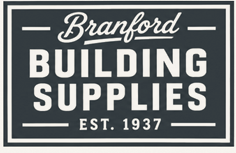
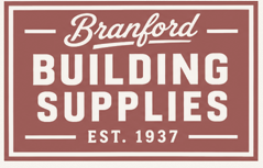
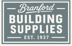
The Hybrid direction brings two strengths together: the familiarity of Branford's historic signature and the confidence of bold, modern building-supply typography.
A structured, signage-inspired composition gives the identity a practical and substantial presence.
The vision: Preserve the personality people recognize while making Branford's full-service building-materials identity more prominent than ever.
Authentic. Substantial. Versatile.

The digital equivalent of sketching—strictly focused on shape, negative space, and silhouette before adding any color. A brain dump before narrowing down concept direction.

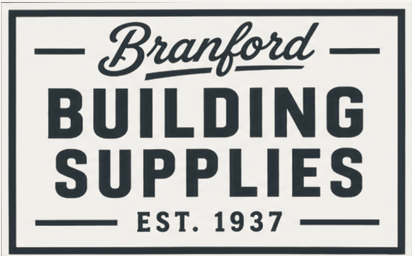
The familiar Branford script retains the company's character.
Bold BUILDING SUPPLIES typography gives greater visual prominence to the breadth of its business, while the enclosing frame unifies the elements into a confident signature.
The founding year reinforces the company's established reputation.

The alternate configuration retains the identity's recognizable ingredients while adapting their scale, spacing, and arrangement.
Its structured composition offers flexibility for signage, print, digital communications, and other applications where a contained mark is useful.
The standalone B, contained within an open architectural frame, extends the structured visual language of the primary identity.
Simple, substantial, and adaptable, it creates an opportunity for consistent identification across smaller branded surfaces.
The Quarry & Iron palette draws from architectural materials, craftsmanship, and the understated character of the built environment.
#293237
Strength and authority
#985450
Warmth and distinction
#D0C7BC
Material character
#F4F1E9
Balance and clarity
#65777B
Contemporary versatility
The result is professional and grounded, with enough warmth to retain Branford's approachable character.


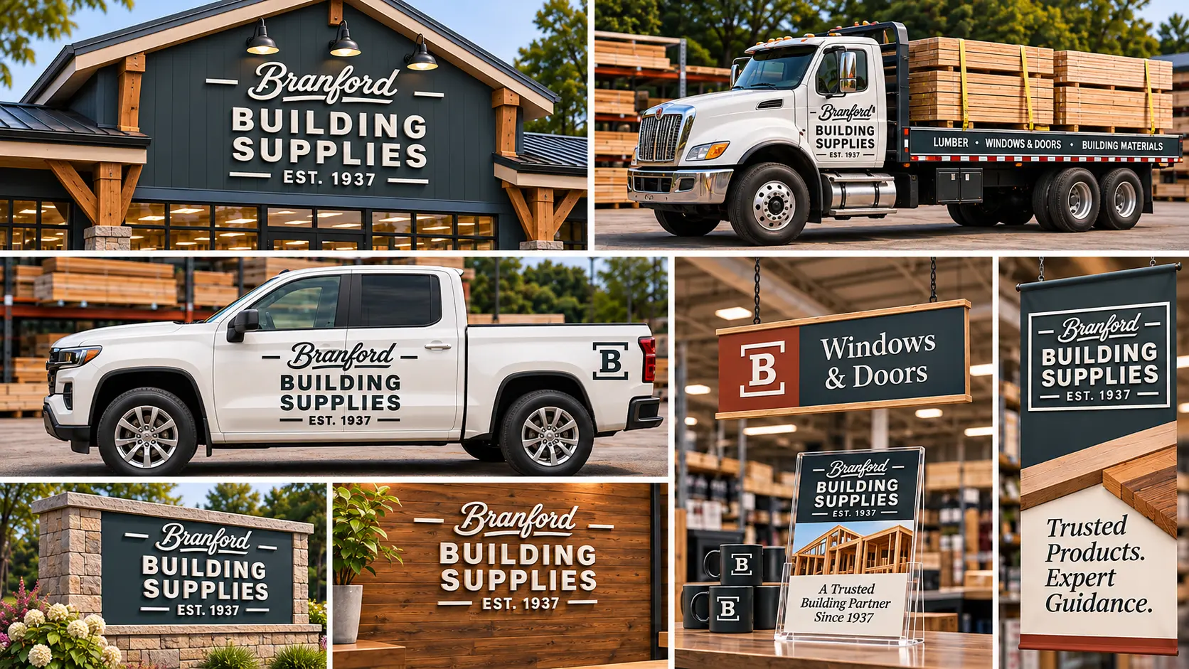
The defined frame and high-contrast typography allow the Hybrid identity to work confidently across light and dark surfaces.
The system remains consistent whether shown in Iron, reversed in white, or expressed in Quarry Red and Steel Slate.
The Hybrid system draws strength from its clarity and structure.
It can translate naturally to exterior signage, printed materials, equipment, apparel, and branded building products—while retaining the historic signature that connects customers to Branford.


HERITAGE — Recognition & Continuity
Preserves the historic signature and celebrates the reputation Branford has earned.

MODERN — Strength & Visibility
Creates a bold, future-facing expression designed to communicate professional authority and regional presence.

HYBRID — Character & Capability
Combines the familiarity of the original lettering with a structured identity that gives greater emphasis to the building-supply business.
Each direction carries the same brand promise. The difference is what we choose to emphasize visually.
Like Branford's Future?
As we evaluate the concepts, the goal is not simply to choose the most attractive logo.
It's to identify the visual identity that best expresses Branford's character, capabilities, and ambitions.
Our discussion should focus on:
From here: We'll refine the strongest direction, validate its performance across real applications, and develop a consistent identity system ready for the next chapter.
Established in 1937. Built for the work ahead.